There’s no denying that smoothly managing reservations and preventing missed bookings is a crucial aspect of running your business.
A hiccup here can lead to dissatisfied customers and lost revenue.
Luckily, restaurant reservation confirmation emails are one of the most direct and straightforward ways to help you keep everything in order.
And this article will be your guide to mastering the art of crafting these emails.
We’ll dig into why reservation confirmation emails are essential, what components make them effective, cover some dos and don’ts, and finally show you some great example emails to help you get started.
First, we will try to convince you of the value of using these emails in your operations.
Why Are Reservation Confirmation Emails Important
The power of restaurant reservation confirmation emails lies in the fact that they allow you to better secure your guest’s reservations for each night.
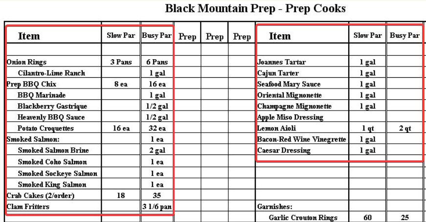
Let’s start with an example. Picture this familiar sight—a food prep list.
Source: Chef’s Resources
These lists usually depend on the volume of reservations for each night. Expected busy nights require more prep, and slow nights need less.
So, imagine your staff preparing ingredients for a full restaurant capacity as per your reservation list, and then 20% of those bookings being no-shows.
That’s a waste of food and labor, and leads to lost revenue.
But hold on, where do confirmation emails enter the scene?
These nifty little messages protect you against no-shows. What if you could transform those missed reservations into timely cancellations instead?
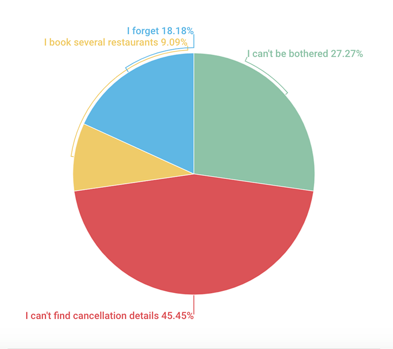
Take a look at this Carbon Free Dining survey data showing why guests fail to cancel reservations and end up not showing up.
Source: Carbon Free Dining
Notice that aside from people who book several places or simply don't feel like canceling, almost half of them need help finding cancellation details, and 18% of them forget about their reservations.
That's where confirmation emails come to the rescue.
They provide guests with an easy way to see and manage their booking and give you a way to ask guests to re-confirm their reservation or allow them to cancel.
Also, that little ping in their inbox can jog the memory of those who simply forgot.
And voila, that’s 63% of the reasons guests fail to cancel a reservation, efficiently handled.
Reservation confirmation emails are an essential tool for battling no-shows, so it's imperative to utilize them effectively.
What to Include in a Reservation Confirmation Email
But how can you make the most out of these messages? Let’s now consider the essential pieces of information that you should include in the emails.
It’s necessary to put some thought into what goes into your reservation confirmation emails.
After all, you want to provide all the necessary details without overwhelming and confusing the guest with a wall of text.
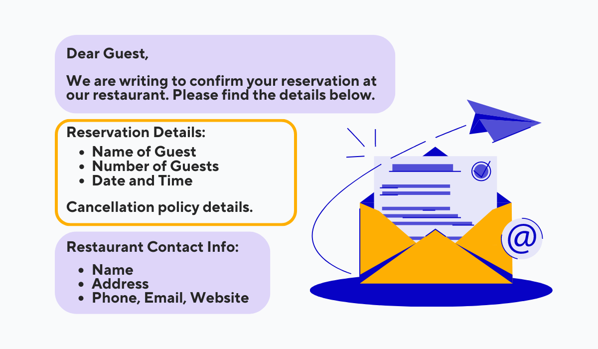
Some elements of these emails should be non-negotiable. And guess what? We’ve included those elements in this simple template shown next.
Source: Tablein
It’s always nice to kick things off with a short and friendly greeting and let the reader know what the email is all about. Write what you like here, just keep it short and sweet.
Then comes the crucial aspect of the message, the reservation details.
Make this information clearly visible and include your booking and cancellation policy so guests can stay informed.
Lastly, remember to include your restaurant's contact info so people know where to reach you.
Besides the content of your emails, how you arrange and display it is as—if not more—important.
 Source: BeeFree
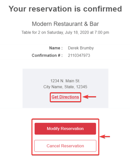
Check out this reservation confirmation email example shown above. The essential details really stand out, don’t they?
A bold “Get Directions” link can be a real lifesaver for your guests that need help finding your establishment.
And no one can miss the large and bright buttons for modifying and canceling a reservation.
To sum up, paying attention to what content you include in reservation confirmation emails and how you display it is key for conveying your message clearly and effectively.
Reservation Confirmation Email Dos and Don’ts
The previous section only scratched the surface of the practice of sending reservation confirmation emails. In the following sections, we will cover some more tips and best practices you want to follow.
Let’s dive into the must-dos and the things you should avoid while creating your reservation confirmation emails.
The Dos
We will begin with two best practices for sending confirmation emails.
First off, automating the email-sending process is a must. I mean, picture yourself sending an email manually every time someone makes a reservation.
Let’s illustrate the alternative with an example.
Say you want to make a reservation at WowYauChow. You pick the date and time, and you finish making the reservation.
The second you book, you get a confirmation email in your inbox.
 Source: Tablein
Automatic, smooth, no fuss. How do they manage this feat of wizardry? By using our restaurant reservation system, Tablein.
Simply set the reservation confirmation option to automatic, and each guest that books a table through Tablein will instantly receive a confirmation message.
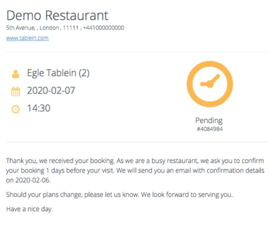
If you're more into hands-on control, though, you can manually customize when these emails go out. Take a look at the following image.
 Source: Tablein
The image shows a clear and simple approval email that asks guests to re-confirm their booking, and you get to choose how many days in advance it gets sent to them.
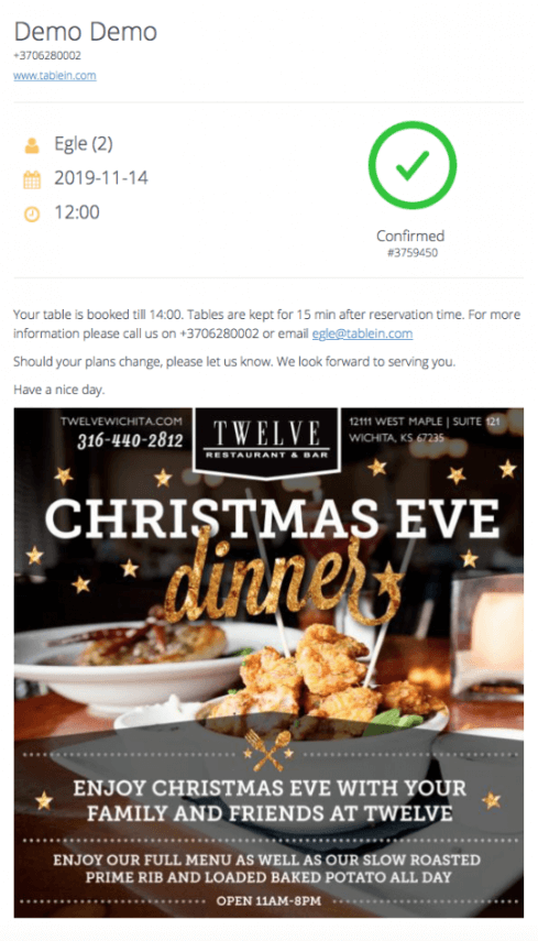
Now, what if we could upgrade these confirmation emails even further?
 Source: Tablein
The screenshot above shows how you use Tablein to attach images in an email with your offers and promotions.
And just like that, you've turned a simple confirmation email into a marketing asset. Now, guests might be tempted to make another reservation for your upcoming event.
By doing so, you’ve used the powerful marketing capabilities of email, another best practice that you need to consider.
Overall, taking advantage of automation and using the email customization capability of Tablein saves you time and turns these simple emails into marketing opportunities.
The Don’ts
While crafting confirmation emails might seem straightforward, there are many ways you can go wrong, some of which we will cover in this section.
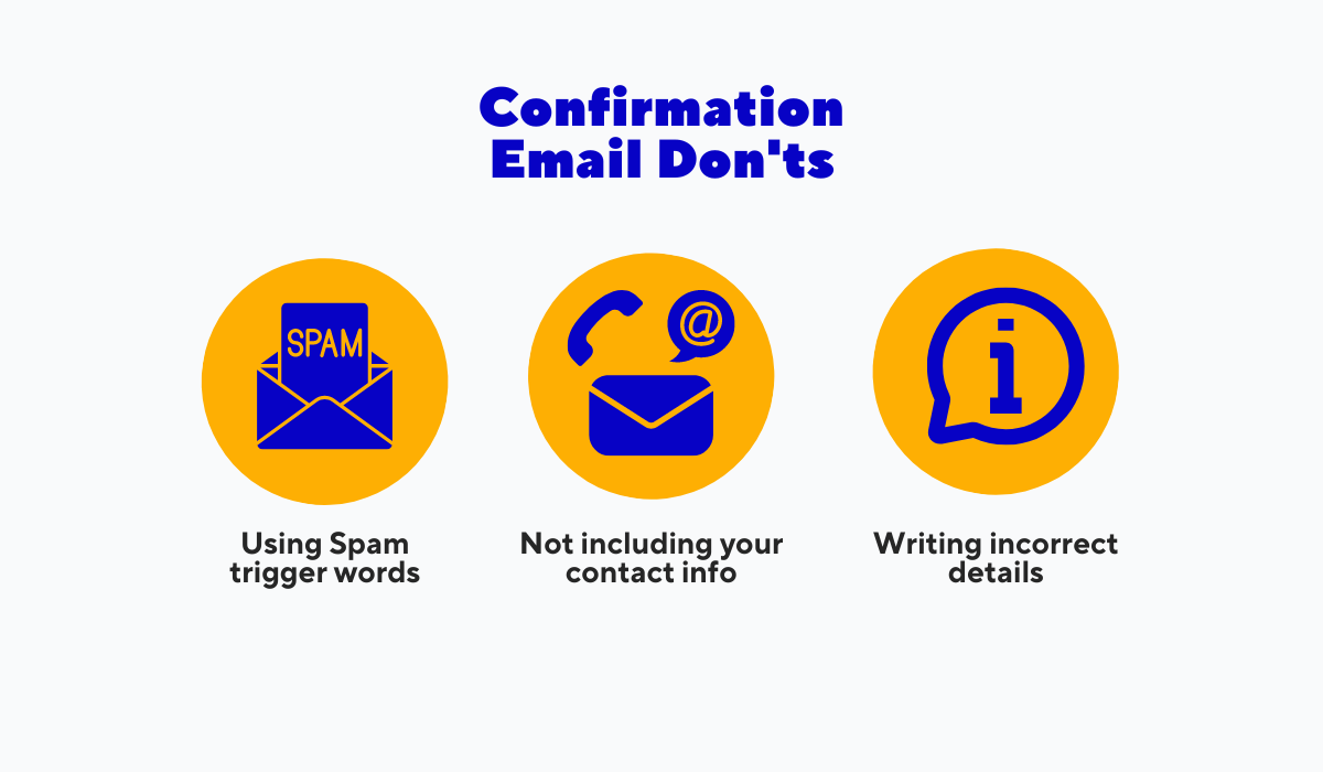
Take a look at the next image showing three common things you should steer clear of to ensure guests receive helpful and informative emails.
Source: Tablein
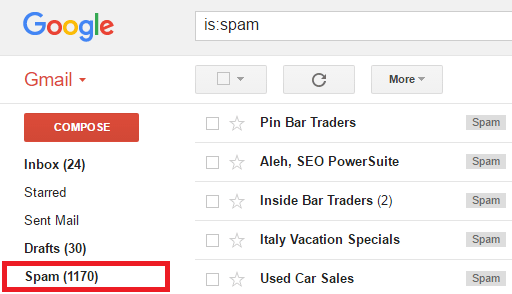
Say you crafted the perfect confirmation email. It’s even automated and gets sent to your guests when they book a table. One problem—it lands in their spam folder.
 Source: Techperdiem
We all know the spam folder is a black hole. With the avalanche of emails we receive daily, your reservation confirmation might be forever lost.
One fix for this issue is to stop using spam trigger words in your messages.
Spam filters are relentless, and phrases like “free,” “guarantee,” or “special promotion” should be avoided.
Keep your wording simple. After all, confirmation emails should be clear and informative ways for guests to view their reservation details.
Okay, so your email has dodged the spam folder. A guest opens the email and wants to reach out, but they can’t find your contact info.
Not including these details is a big oversight that can prevent guests from finding your eatery or calling you to make changes or cancel their table bookings.
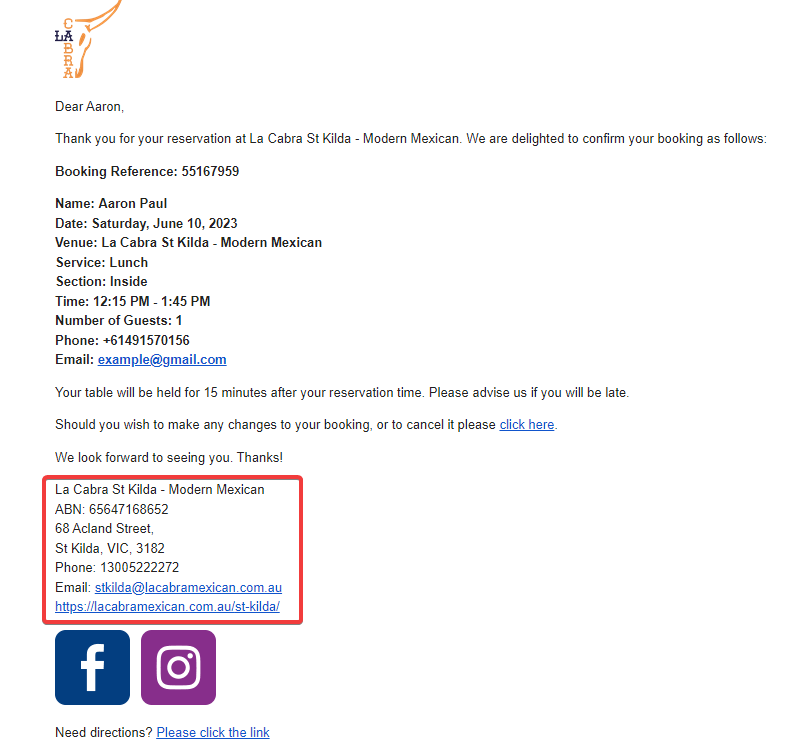
Take a look at La Cabra’s reservation confirmation message to see how it’s done.
Source: Tablein
This confirmation email is short but includes everything a guest might need—the restaurant’s physical address, phone number, email, and website.
Another thing La Cabra nails is avoiding the third inadvisable practice, which is including incorrect information in your emails.
While reservation systems will accurately write most reservation details, always double-check manually entered information, like your booking or cancellation policy.
By avoiding all of these common pitfalls, you ensure smooth and efficient communication with your guests through your confirmation emails.
Examples of Great Reservation Confirmation Emails
Having gone through the practices we’ve covered, you're probably eager to see what a polished confirmation email actually looks like. No worries, we’ve got your back.
Take a look at these three examples of restaurant reservation confirmation emails that can serve as your inspiration.
Lolita Tequila Bar (Boston, USA)
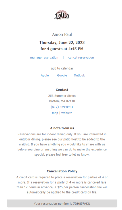
First off, we have the clean and straightforward email crafted by Boston-based Lolita Tequila Bar, which you can see in the following screenshot.
 Source: Tablein
Straightforward and simple, the email follows the sections we showed you in our confirmation email template nicely.
The reservation specifics take center stage, rendered in bold and slightly enlarged text for emphasis.
Following that, there are two links for modifying or canceling the reservation, accompanied by a few options that allow guests to seamlessly add the booking to their calendars for additional reminders.
Then come the contact details, a note that explains some of the specifics, and a section that clearly displays the cancellation policy.
And that’s it. A simple and effective confirmation email that you can use as a reference for your business.
The Coconut Club (Barcelona, Spain)
Let’s now look at a more detailed email.
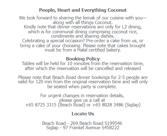
Take a look at some of the sections of The Coconut Club’s confirmation email shown next.
 Source: Tablein
As you can see, this email has a bit more content to it, including some clarifications about dinner reservations and celebrating special events, as well as a short booking policy after.
Note that the essential details, such as the contact and location info, are still included at the bottom.
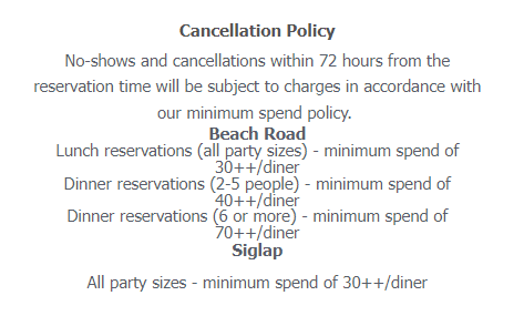
Along with these sections, the email has a separate cancellation policy that displays the cancellation fees if guests fail to cancel 72 hours in advance or end up being no-shows.
Source: Tablein
With hefty fees per diner, we doubt anyone who reads this email thoroughly will forget to cancel a reservation on time or dare not to show up for their booking.
Overall, The Coconut Club opted for a more detailed message that ensures guests are fully informed about the restaurant’s policies and fees.
WowYauChow Altrincham (Manchester, England)
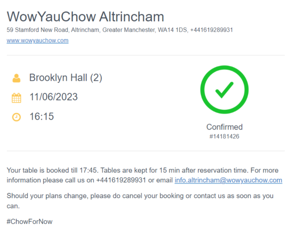
Finally, we have an email that uses some well-placed graphics for additional clarity.
Remember the restaurant WowYauChow that we mentioned in an earlier section? Well, their confirmation email is shown in the screenshot below.
Source: Tablein
The big green checkmark is what catches the eye at first glance, along with the reservation number below it.
Guests viewing this email will have no doubts their reservation went through, and they will quickly be able to see their reservation details displayed in a big font on the left side.
Although this is the shortest email out of the three, no crucial details are missing.
All contact and reservation details are there, along with a message urging guests to cancel on time if their plans change.
WowYauChow chose not to go overboard with text and ensured their email was short and sweet.
Take this email as an example, and add any additional details if you deem necessary.
Conclusion
And with that, we’ve finished exploring the world of restaurant reservation confirmation emails.
From understanding their significance to the nitty-gritty of crafting effective emails and using automation to aid your efforts, this comprehensive guide aims to equip you with all the tools you need to get started.
By now, you should realize the potential of these emails in enhancing your customer experience and streamlining the reservation process.
Implementing the practice of regularly sending confirmations can keep your patrons informed, unlock marketing opportunities and give you a financial safety net by preventing no-shows.
So, what are you waiting for? Fasten your apron and use our tips to cook up some stellar confirmation emails.
Get a 30-day Exclusive Trial
As a Tablein blog reader, you’re eligible for an exclusive 30-day free trial to experience our simple reservation solution for your restaurant.
Enter your business email, and we’ll send you all the steps needed to create your account.
Share this
You may also like

How to Handle Group Reservations at Your Restaurant

Best Practices for Creating a Seamless Restaurant Reservation Experience
