The value of attracting more reservations at your restaurants cannot be overstated. After all, reservations shape the success and profitability of your business.
An often overlooked way to increase the number of bookings at your restaurant is through your website.
Our article will provide you with practical insights into optimizing your website into a digital billboard that will draw in new customers.
We will focus on the contents of your website, its look, and several other tweaks you will surely want to implement.
Let’s explore some ways to transform your website into a more effective platform.
Showcase Your Restaurant’s Menu
Let’s start with how having your menu online can significantly influence your restaurant reservations.
Your menu is the first glimpse potential diners get of your culinary prowess, and it acts as an enticing preview of the experience they can expect from your establishment.
Having it on your website allows customers to assess your offerings, the variety of dishes, dietary options, and prices before deciding to book a table.
Making sure the menu is prominently featured on the website becomes even more crucial, when you take into account that about 77% of diners visit a restaurant’s website before they place an order or come to dine in-house.
It's an excellent opportunity to flaunt your delicacies and tempt them to pay your restaurant a visit.
For this reason, many successful restaurant websites make sure their menus take center stage on their homepage.
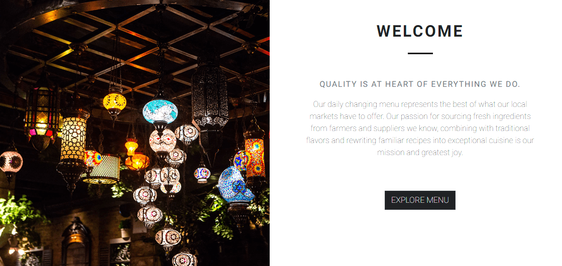
Source: Up Thai
For example, if you explore Up Thai's website, you're instantly greeted with a section highlighting the quality of their ingredients and food, along with a button that whisks you straight to their menu.
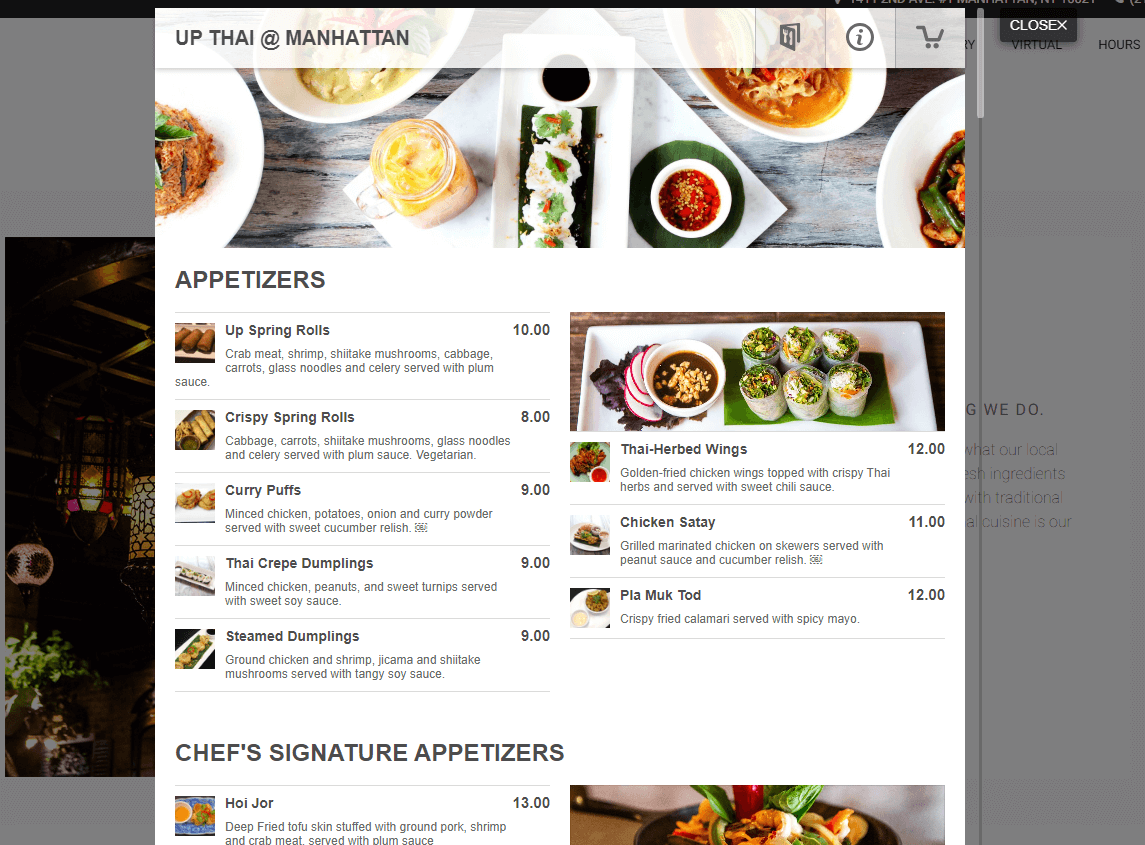
Source: Up Thai
Instead of a redirect to a PDF file, their menu appears directly on the website.
This is a significant advantage as it ensures a smoother user experience and keeps the visitors on their site, thus avoiding possible distractions.
But what if you have multiple types of menus to display? No worries!
You can elegantly display them all separately on your website, just like they’ve done at London's Norma restaurant.
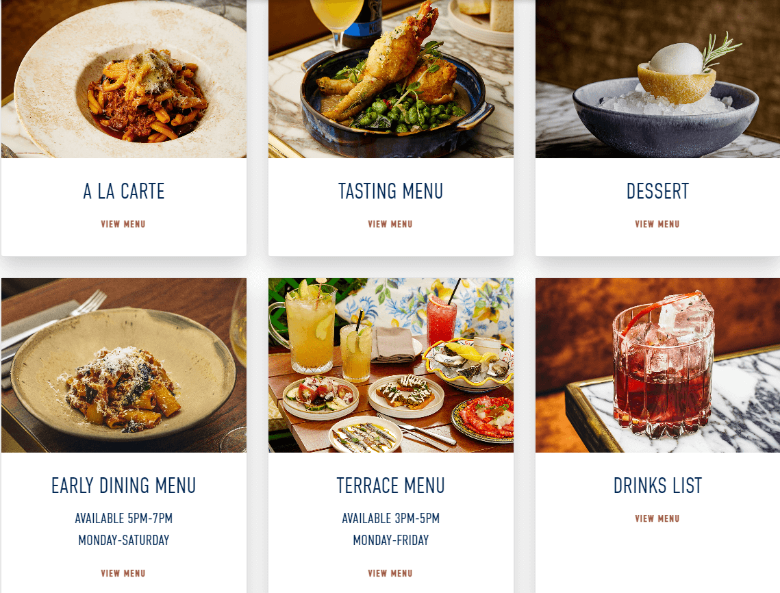
Source: Norma
Just remember to make it as visually appealing as possible. Incorporating high-quality, appetizing food photographs of your menu items can work wonders.
After all, we eat with our eyes first! Ensure your dishes look as scrumptious online as they do on the plate.
As a final note, before showcasing your menu on your website, you should guarantee that it's well-optimized for increasing sales through effective menu engineering, something you can learn more about in our article on the topic.
Overall, featuring your menu on your restaurant’s website can paint an inviting picture of the dining experience that awaits guests at your establishment.
Bring Attention to Important Information
By learning more about showcasing your menu on your website, we’ve already dipped our toes into this next section, which focuses on the value of bringing attention to important information as a way to increase reservations.
Just think about it.
Your website is like a digital front door for your restaurant.
Just as you'd arrange your actual restaurant and menu to highlight your most enticing offerings, it's crucial to design your website to bring attention to the most important aspects.
You want to provide your potential guests with all the details they need as swiftly and smoothly as possible.
The majority of your website visitors will need just a few things from it, and most of the time, those will include the following:
- Your location
- The opening hours
- Your menu
- How to make a reservation
These are the crucial pieces of information that your customers will be hunting for. And you guessed it—they're all critical to your guests making a reservation.
Look at the image below to see how the Melbourne-based eatery Fancy Hanks has highlighted their key information.
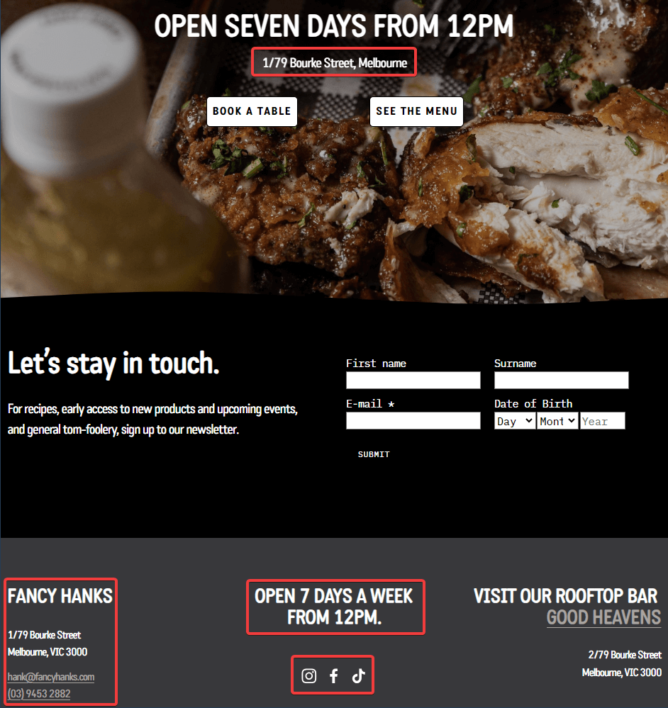
Source: Fancy Hanks
The establishment’s location, opening hours, booking button, and menu button are all clearly displayed and repeated in multiple places on their site.
In addition, they also highlight their social media accounts, another important channel for potential reservations.
Anyone that visits the Fancy Hanks website will be able to find most of the information they are looking for in just a few seconds.
But why stop there? There's more to your restaurant than just the basics, right?
So, why not bring attention to your special offers or any other unique selling points?
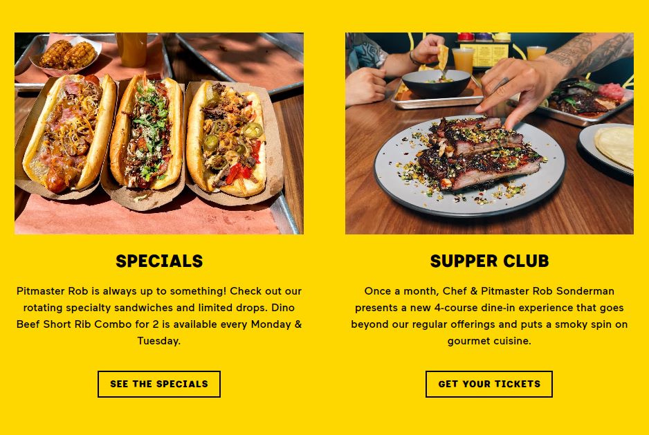
Source: Federalist Pig
Promotions like discounts, special menu items, and events can all be exciting and pique the interest of your website visitors.
Essentially, anything that could make your restaurant stand out and influence your guests to book a table can (and should) be highlighted.
With the right attention to the important details, your website can become a powerful tool for driving reservations, so make sure you don’t miss out on this step.
Design an Effortless Reservation Process
Alright, you've built a stunning website that’s ready to captivate your guests and provides them with all the info they might need.
Now, it's time to ensure that the reservation process itself constitutes a pleasant journey.
Designing an effortless reservation process on your restaurant's website is essential, as it directly impacts customer satisfaction and willingness to dine in.
A simple, user-friendly process keeps potential customers engaged and increases the likelihood of them finalizing their booking.
The adventure begins the moment a guest clicks the reservation button on your website.
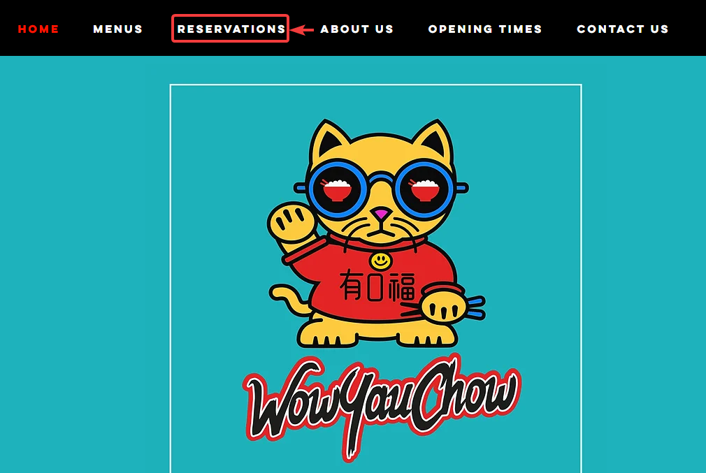
Source: WowYauChow
Notice how WowYauChow does it. When someone decides to make a reservation, they are given a choice between the establishment’s Swinton or Altrincham locations, as shown in the image below.
Now, you may be wondering, what happens next?

Source: WowYauChow
Is the customer directed to a contact page where they can find a phone number to call staff and make a booking?
Or is a separate screen opened where the guest can write and send a message to the restaurant?
The answer is neither. It’s much simpler than that.
The difference lies in WowYauChow's use of our table reservation system, Tablein.
The tool integrates seamlessly with the website to provide a smooth user experience and allow guests to book a table through our software.
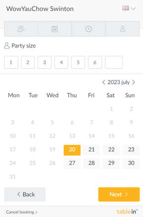
Source: Tablein
When guests decide to book a table, for instance, at WowYauChow’s Swinton location, they are presented with Tablein's intuitive booking interface. It's all about simplicity here.
The guest can make their reservation in just a few easy steps by selecting their party size, date, and time.
Making sure that the reservation process is effortless is vital.
After all, you don’t want to deter guests from completing their reservation when they’ve already decided to book a table due to a complex or confusing booking process.
After a few quick clicks, guests will be presented with the following screen.
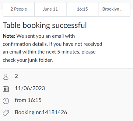
Source: Tablein
Just like that, the guest has successfully booked their table.
As a bonus, they receive a reservation confirmation email, providing them with an added layer of reassurance in their reservation.
In a nutshell, ensuring a seamless reservation process is key to increasing your bookings.
Modern solutions like Tablein not only streamline this process but make it an enjoyable experience for your guests, too.
Have Multiple Touchpoints for Reservations
Once your straightforward reservation process is ready to roll, it's time to consider adding multiple touchpoints for making a reservation throughout your site.
You may wonder, what does this mean? Simply put, any “Reservation” buttons and links shouldn't be confined to just one corner of your website.
It should be accessible from multiple locations, subtly but effectively encouraging visitors to convert their interest into action.
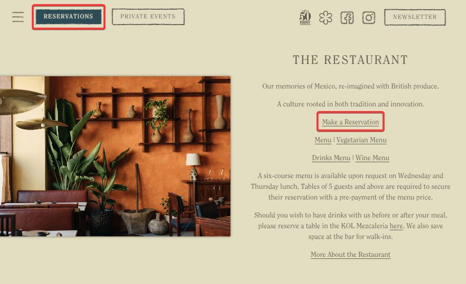
Kol's website paints a clear picture of this concept. At first glance, you'll notice a large and clear call-to-action button right on top of their page.
Source: Kol
Now, imagine a visitor who scrolls down the page, exploring Kol's offerings. They stumble upon something that piques their interest, and right then, they decide to book a table.
But wait, the reservation button is all the way up there. It's not a deal-breaker, but even a minor inconvenience can potentially dissuade a customer. Fortunately, Kol foresaw this scenario.
As you can see in the image above, they've strategically placed multiple reservation touchpoints throughout their website.
In addition to the primary button at the top, they've highlighted a “Make a Reservation” link in their restaurant's info text, effectively creating a secondary, accessible touchpoint.
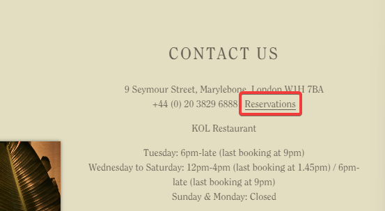
But what if a customer prefers the traditional route of calling to reserve a table and navigates to Kol's contact page to find their number?
Source: Kol
Surprise, surprise—they're greeted with yet another reservations link nudging them toward the more straightforward and convenient online booking process instead.
Looking to amp up your reservation touchpoints game as well? Consider the following places on your website for potential reservation touchpoints:
- Special event pages
- Limited time offers
- Blog or news section
- The FAQ section
Each of these represents a unique opportunity to capture a potential reservation, maximizing your chances of a successful booking.
Remember, the goal is to make the reservation process as accessible as possible, no matter where on your website the visitor might be.
So, don't shy away from adding those extra buttons and links, and watch your bookings multiply.
After all, a little nudge in the right direction can go a long way.
Make Sure Your Website Is Mobile-Friendly
We live in an era where virtually everyone has a smartphone glued to their hand. These little gadgets have changed the way we live, including the way we choose and visit restaurants.
As a consequence, a mobile-friendly restaurant website is essential.
We're not just talking about looking pretty. We're talking about usability. With most of the population owning a smartphone, it's critical that your website is as easy to navigate on a phone as it is on a desktop.
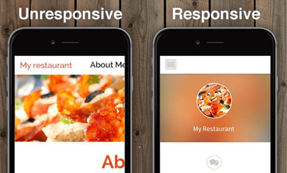
That’s why ensuring you have a responsive website is crucial.
These kinds of websites adjust their layout, images, and functionalities to fit the screen size and resolution of any device, from the widest desktop monitor to the smallest smartphone.
Source: CreativeAgencySecrets
Imagine trying to navigate a desktop-oriented website on your phone. It would be a struggle, right? Too small text, oversized images, things not quite in the right place, it just wouldn’t make a good experience.
This issue isn't just a minor inconvenience. In fact, a bad mobile experience can have a significant impact on your restaurant's bottom line.
According to a survey by MGH, 36% of respondents report being discouraged from ordering food from a restaurant because the website wasn't mobile-friendly.
A significant portion of your potential customers might be using their smartphones to check your menu, see your opening hours, and maybe even make a reservation.
If your website isn't mobile-friendly, you might be leaving money on the table.
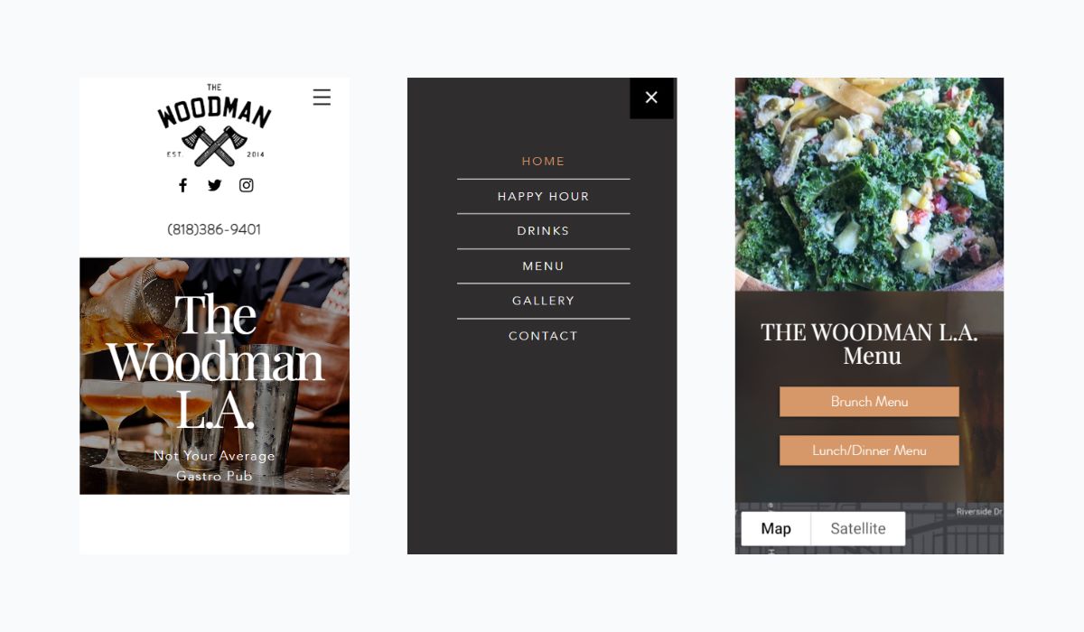
Let’s consider The Woodman’s website, shown below, to illustrate our point.
Source: The Woodman
Their website is a perfect example of a mobile-friendly design. It's clean, easy to navigate, and all the information is clearly displayed and easy to read.
They have made sure that their website offers a pleasant user experience regardless of the device it's viewed on.
Now, you might be thinking, "Well, my website looks okay on mobile." But how can you know for sure? There are some tools available that can give you a definitive answer.
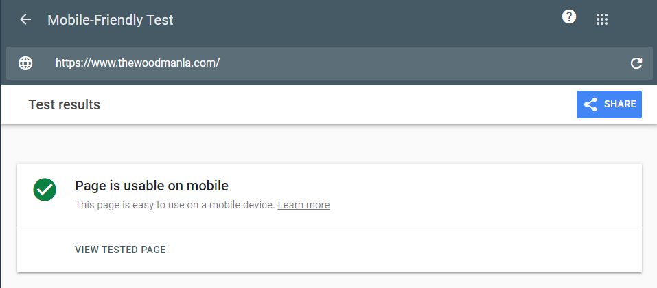
Source: Google
Google's mobile-friendly test, for instance, is a great place to start. Simply enter your website's URL and let it do its thing.
In the example above, The Woodman’s site passed the test, with the results stating that it’s easy to use on mobile, as we would have expected.
If your website passes the test, congratulations! If not, it might be time to make a few adjustments.
Overall, with a mobile-friendly website, you ensure that potential diners can access all the essential information and services your restaurant offers, no matter what device they're using.
Don’t let a non-responsive website stand in the way between you and your next customer.
Conclusion
Throughout this article, we've delved into various tactics for boosting restaurant reservations using your website.
We hope that the information we presented has made you prepared to take actionable steps that will enable you to create a powerful platform that you can leverage to impact your booking numbers.
The approach and strategies we outlined won’t merely generate a transient effect on your booking rates but foster a lasting change, stimulating customer engagement and driving profitability.
Your website isn't just a digital placeholder—it's a powerful tool at your disposal, ready to be harnessed. Act now and unlock its full potential.
Get a 30-day Exclusive Trial
As a Tablein blog reader, you’re eligible for an exclusive 30-day free trial to experience our simple reservation solution for your restaurant.
Enter your business email, and we’ll send you all the steps needed to create your account.
Share this
You may also like

5 Reasons Why You Need a Restaurant Booking System

Best Practices for Creating a Seamless Restaurant Reservation Experience
